Foster+Partner Book Cover Design
Graphic Design
Graphic Design
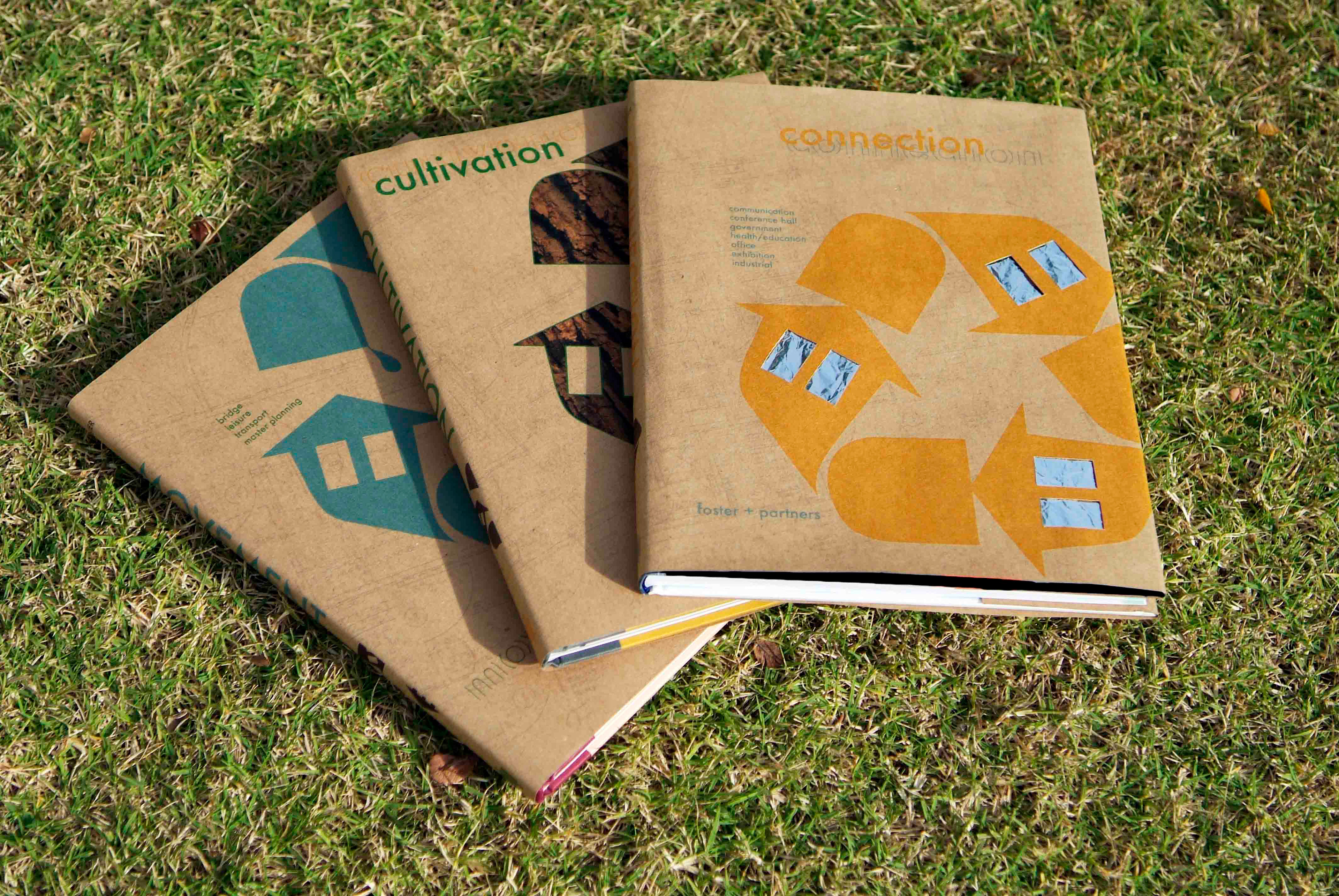
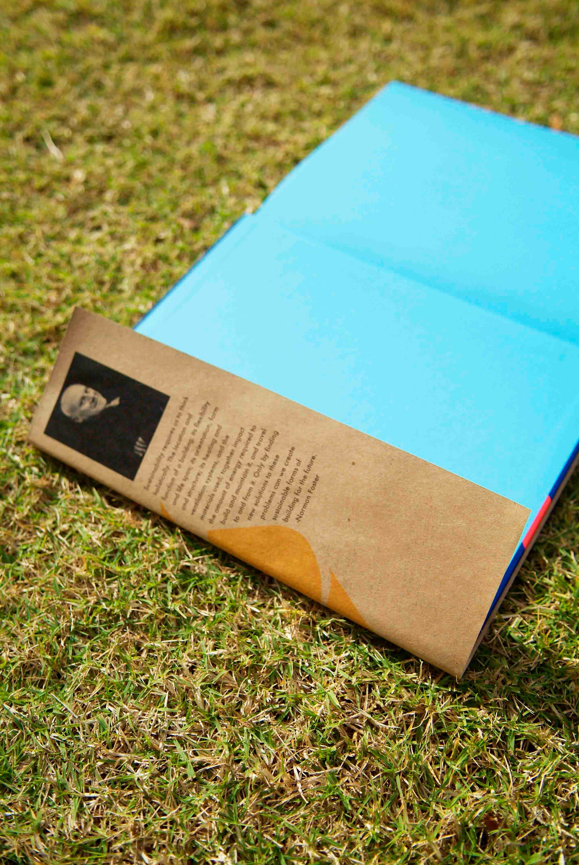
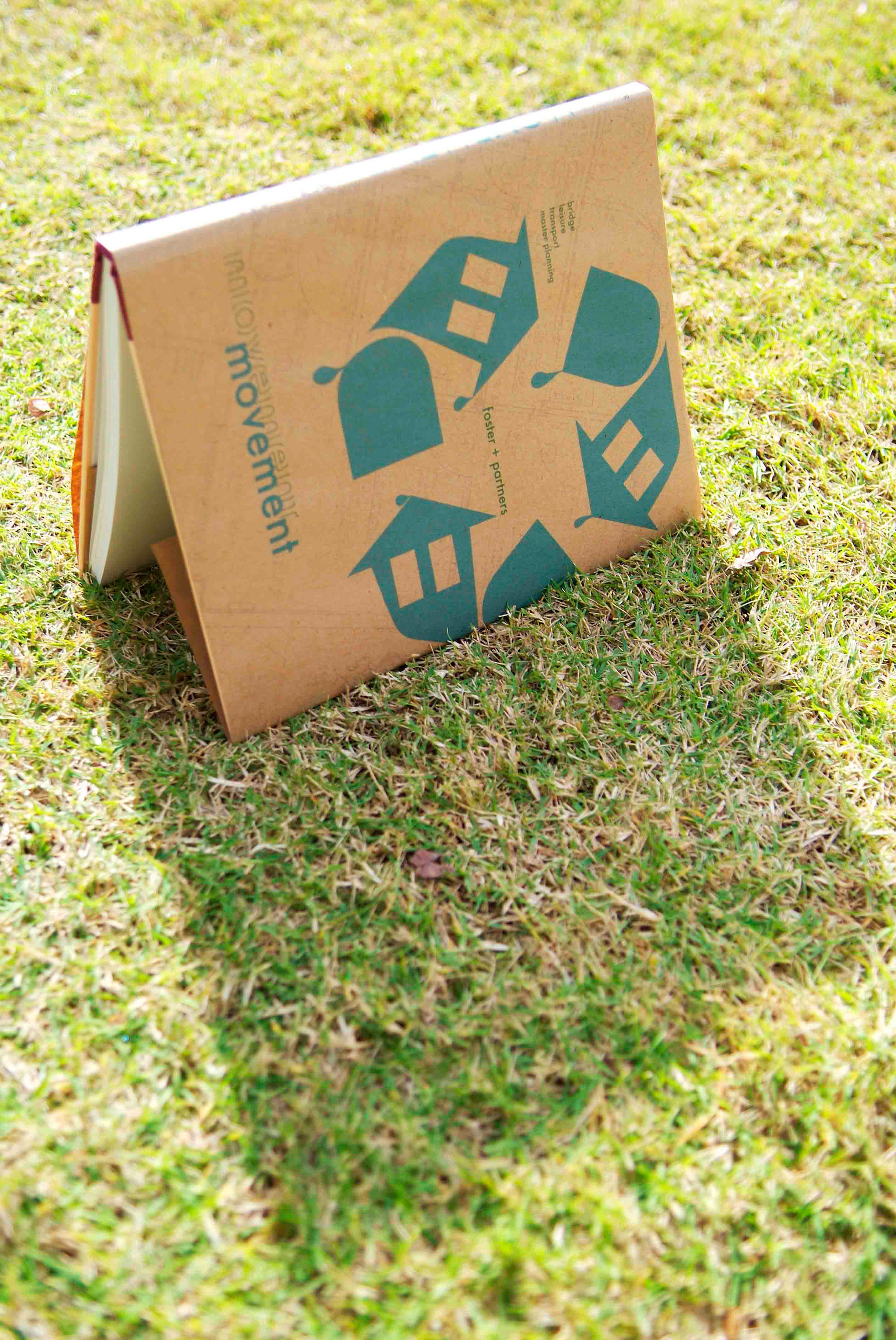
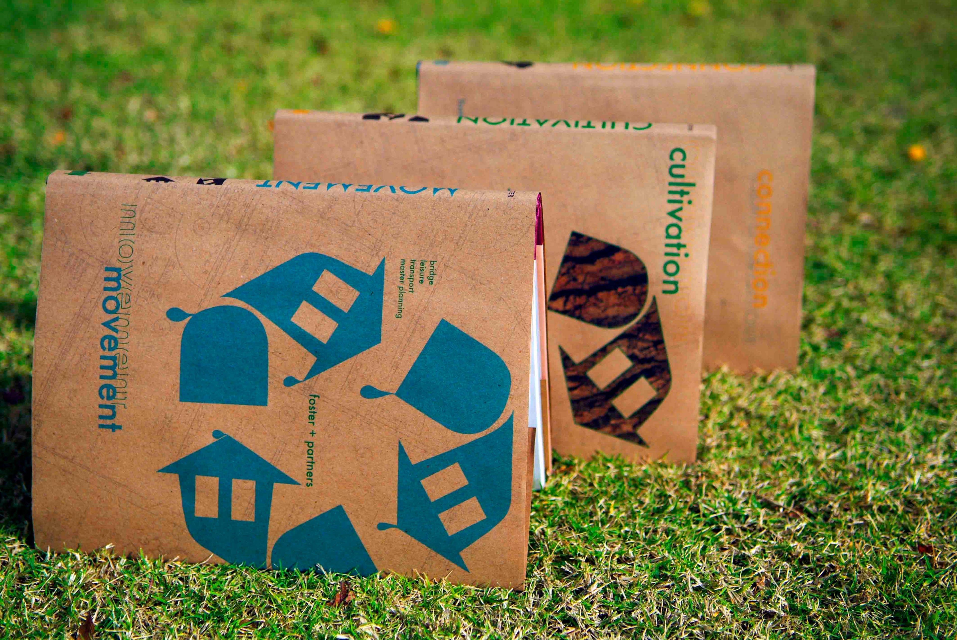
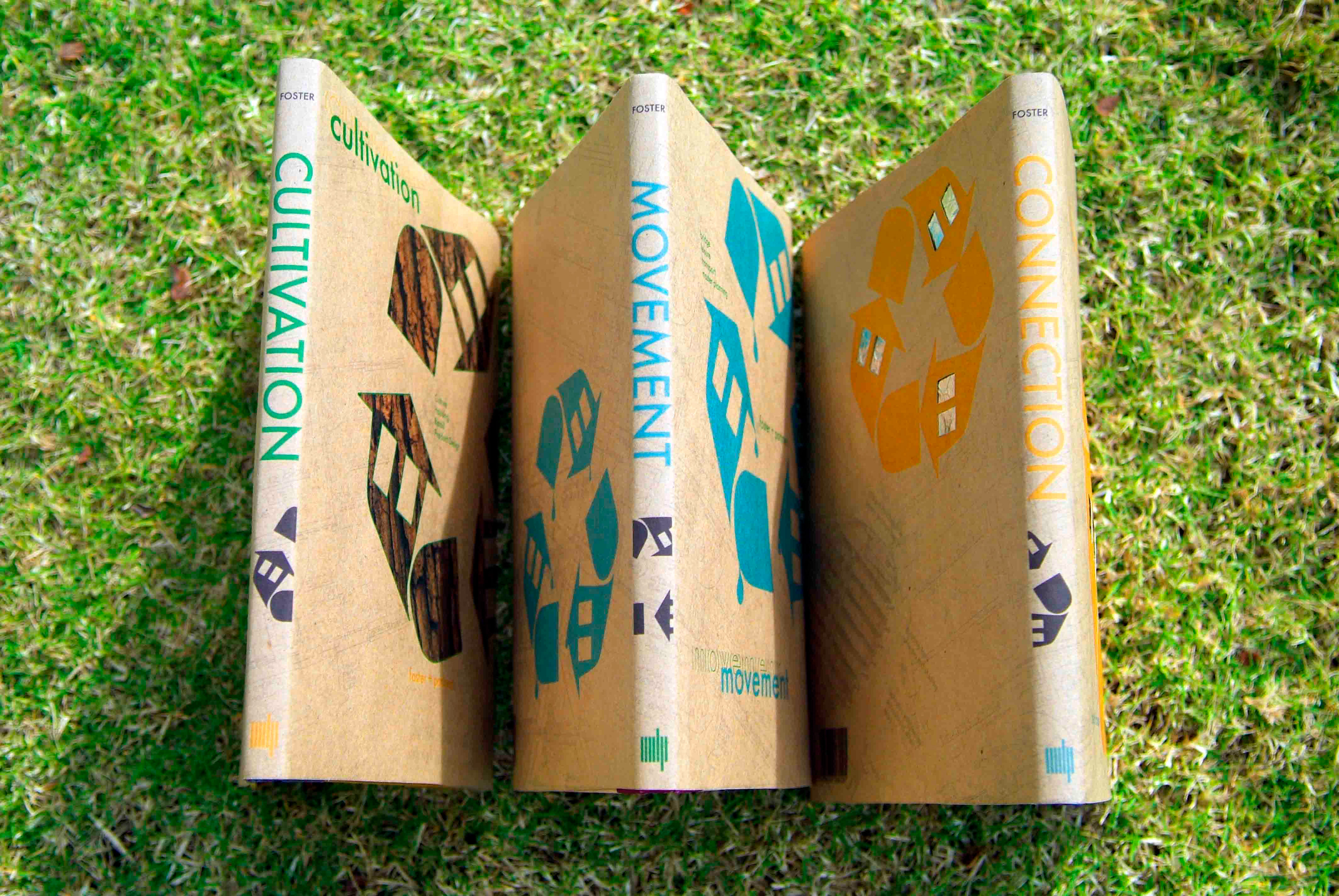
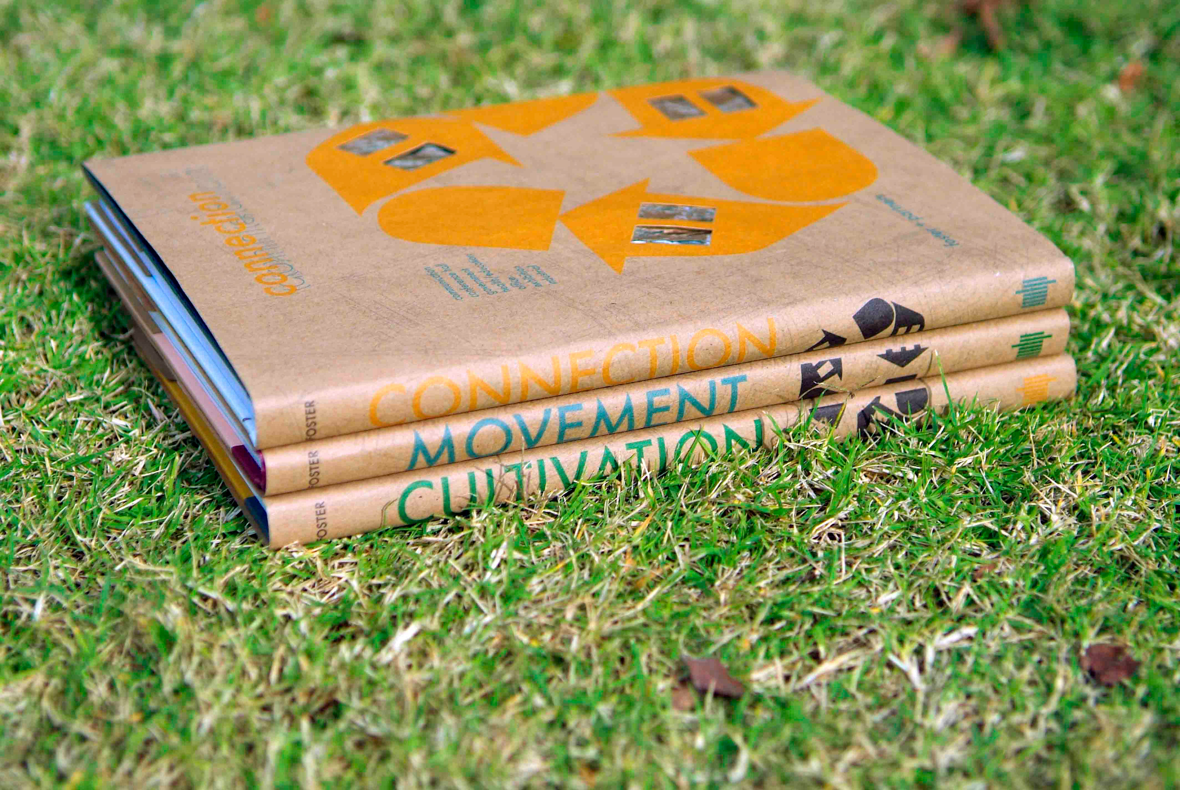
This was a project for Graphic Design 2 last fall. The project was to choose an architect or architectural firm and design 3 book covers for them based on their style, beliefs, structures, etc. The firm I chose was Foster+Partners. This is a firm based out of London, England. They put extreme stress on the economical aspect of their designs - making every inch of the structure as useful or economically friendly as possible.
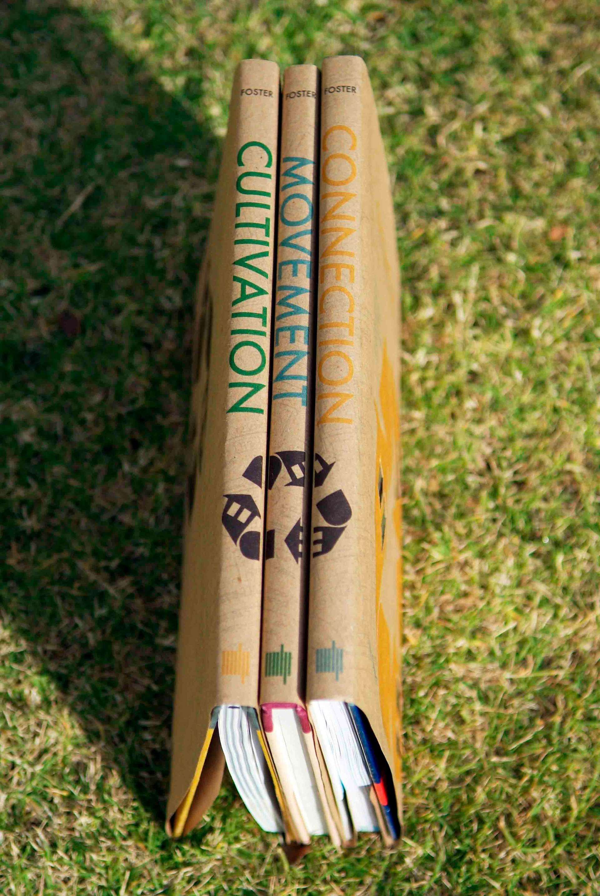
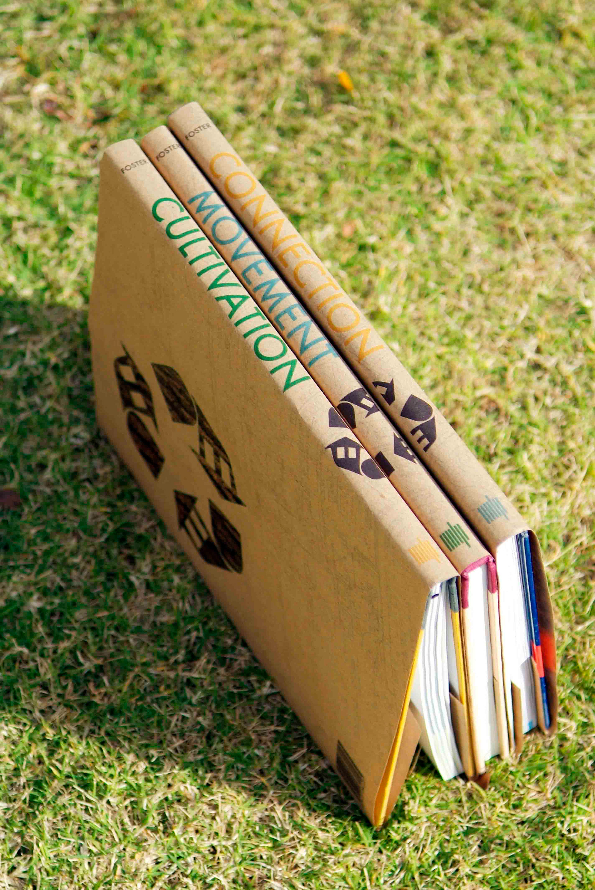
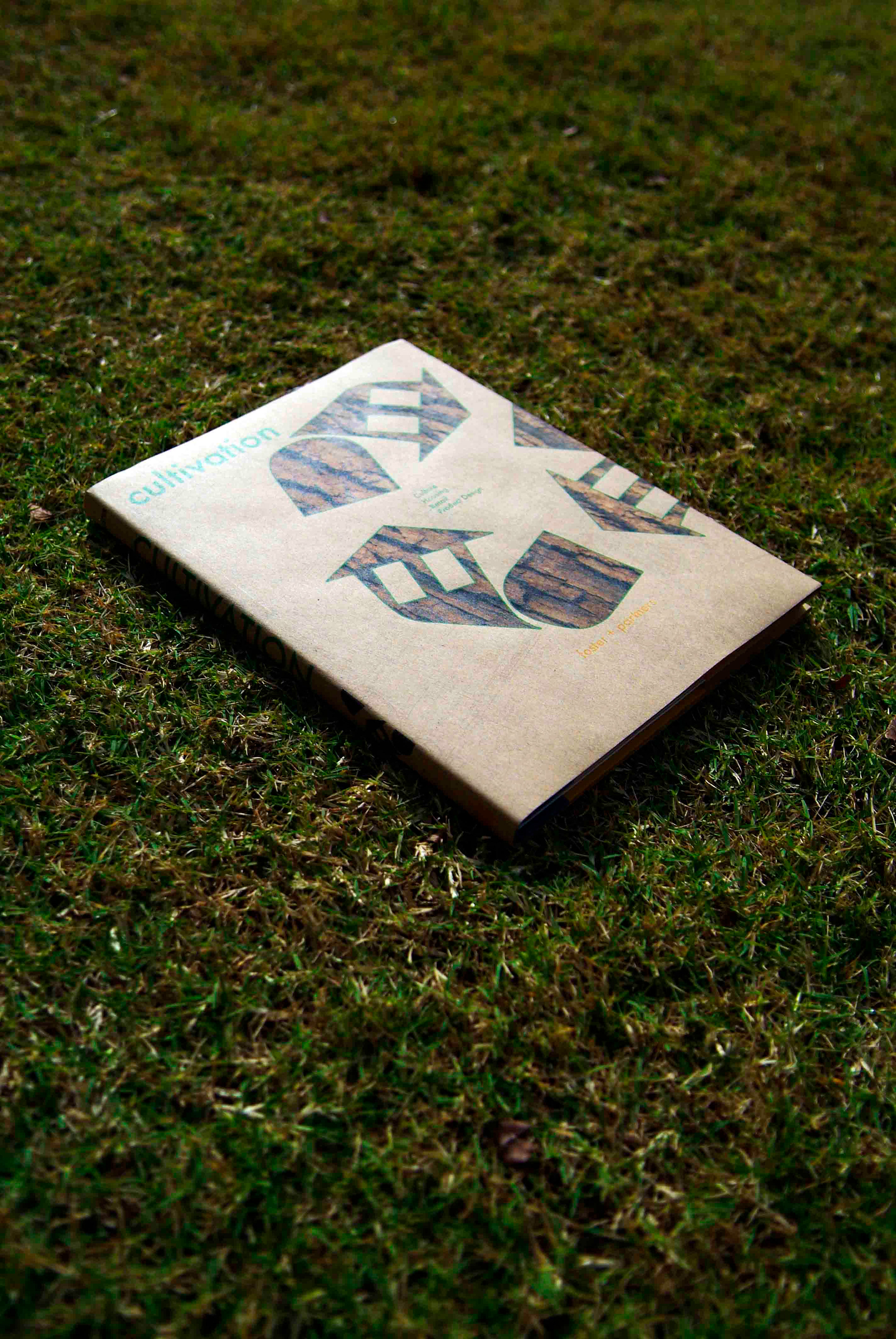
The three books are "Connection," "Movement," & "Cultivation." Each has its own set of categories tying its title in with the different works of Foster+Partners.
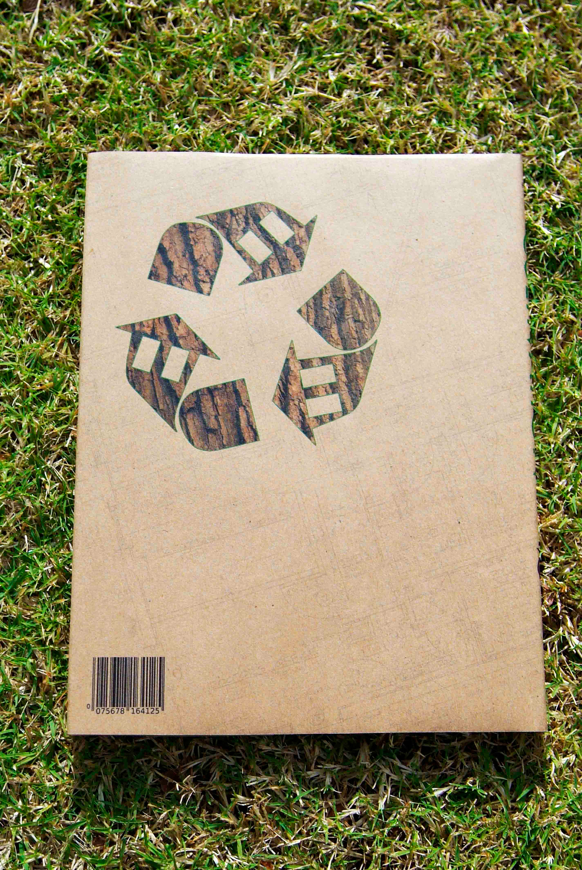
I also designed a symbol that is present on each cover. It is a modification of the recycling symbol - it not only represents recycling, but it has the presence of a building in it as well.
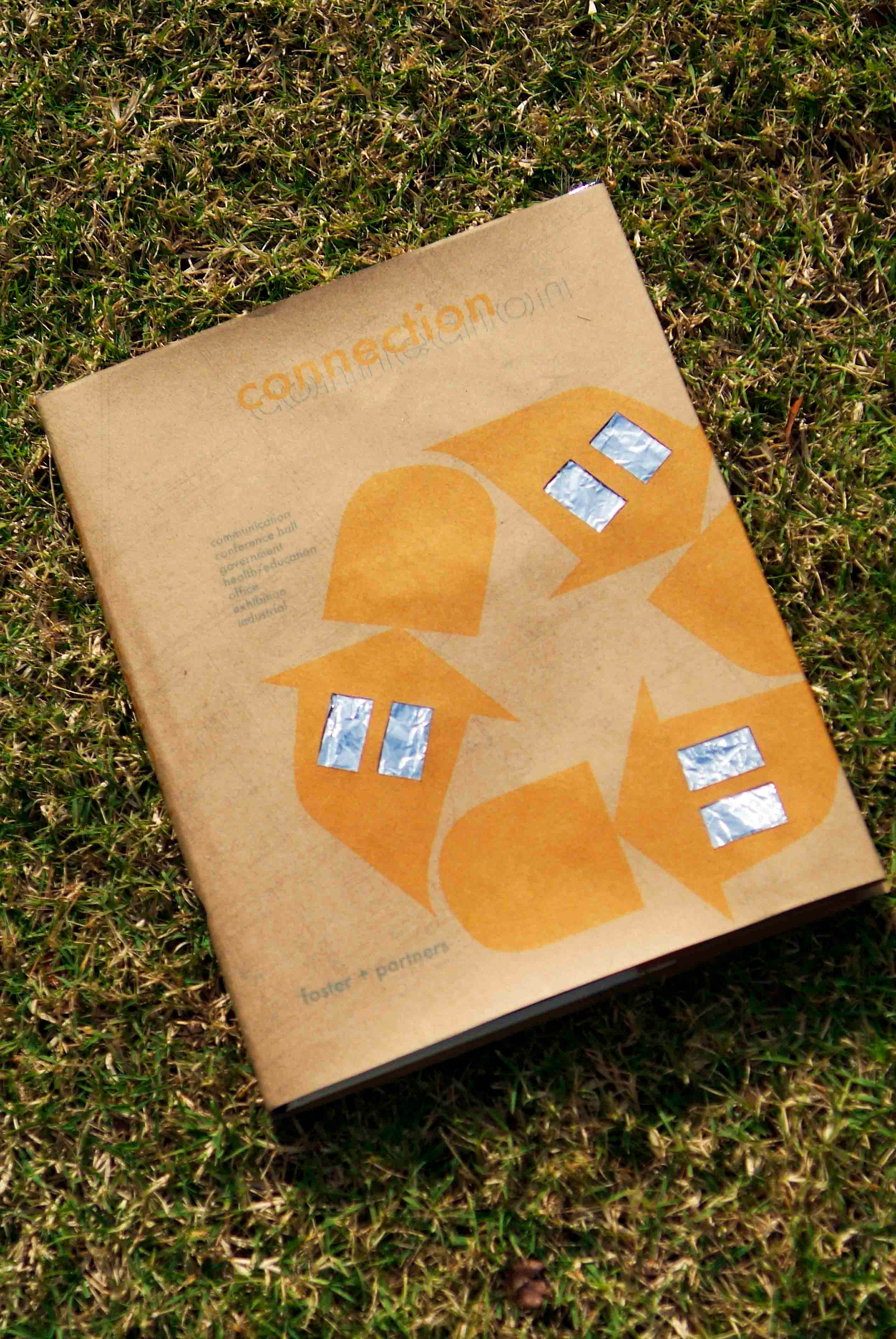
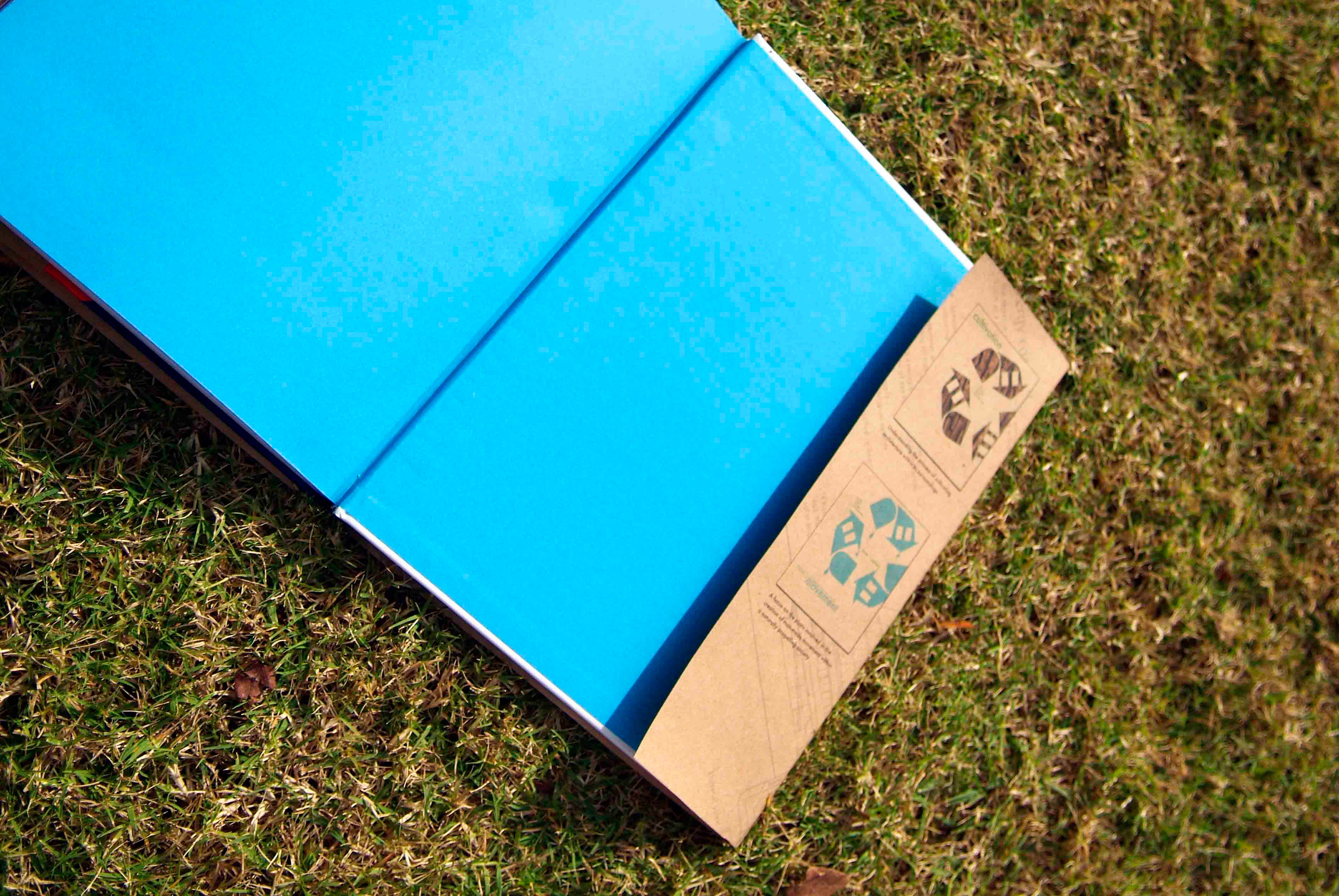
The paper I chose for my design was actual paper sacks - exercising my recycling habits. I also used earth-tones on each cover and foil to represent solar panels on the book titled "Connection".
The three books are "Connection," "Movement," & "Cultivation." Each has its own set of categories tying its title in with the different works of Foster+Partners.
I also designed a symbol that is present on each cover. It is a modification of the recycling symbol - it not only represents recycling, but it has the presence of a building in it as well.
The paper I chose for my design was actual paper sacks - exercising my recycling habits. I also used earth-tones on each cover and foil to represent solar panels on the book titled "Connection".